Data Synergies
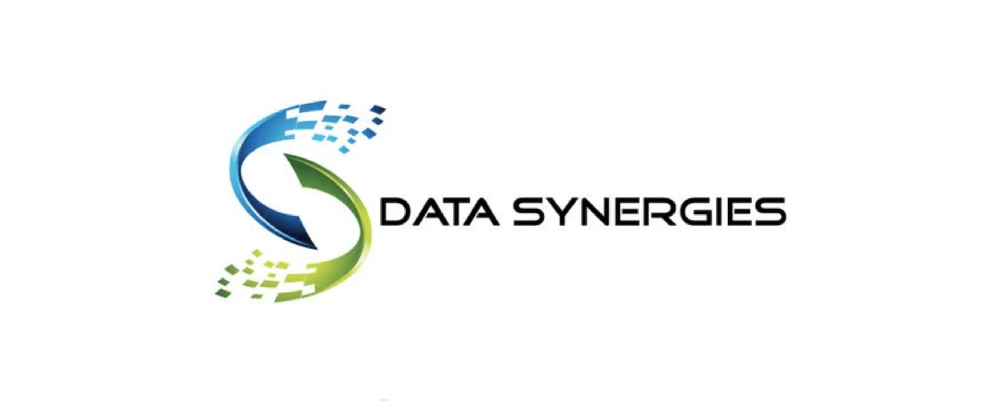
As the designer, we approached the task of rebranding the existing logo with a focus on maintaining the core concept while infusing a more modern and sophisticated aesthetic.
Data Synergies
A data driven, privacy first security consulting agency.
As the designer, we approached the task of rebranding the existing logo with a focus on maintaining the core concept while infusing a more modern and sophisticated aesthetic.
Client
Data Synergies
Year
2022
Deliverables
- Rebrand
- Branding
- Graphic Design
A Brand Refresh for a data driven, privacy first security consulting agency.
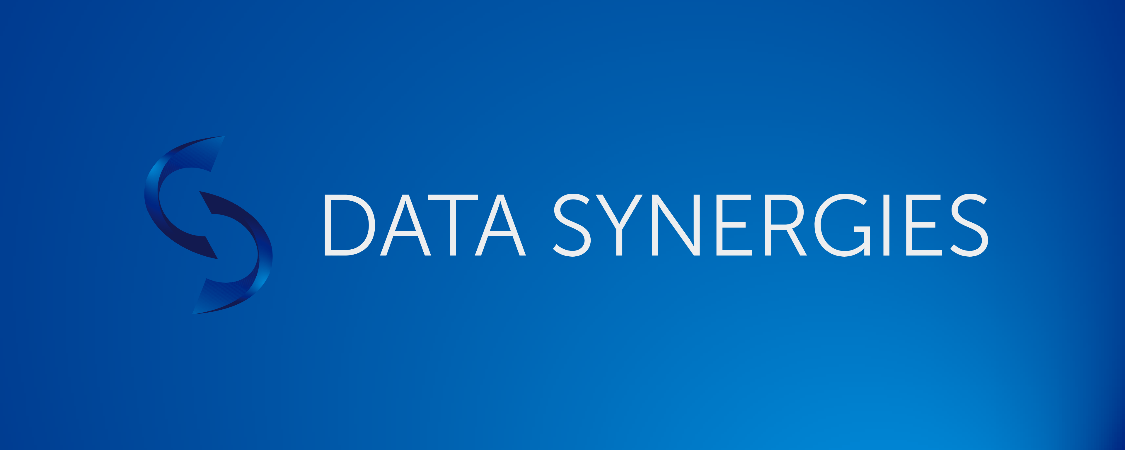
As the designer for this project, Maxwell The Studio approached the task of rebranding the existing logo with a focus on maintaining the core concept while infusing a more modern and sophisticated aesthetic. We chose to delve into a deeper colour palette and introduce subtle highlight colours to add a spark of energy to the brand’s visual identity.
In the redesign process, we paid special attention to incorporating gradients with these highlight colours, both in the overall rebrand and within the brand mark itself. The typography within the logo mark was given a futuristic and sleek appearance by opting for a grotesque font style, aligning with the brand’s forward-thinking and tech-savvy image.
The revamped branding was seamlessly integrated across various digital and print materials, ensuring a cohesive and impactful representation of the brand. By staying true to the essence of the original logo while elevating it to a more contemporary and refined level, we were able to create a visually compelling and cohesive brand identity that resonates with the target audience.
Client
Data Synergies
Deliverables
- Rebrand
- Branding
- Graphic Design
A Brand Refresh for a data driven, privacy first security consulting agency.
As the designer for this project, Maxwell The Studio approached the task of rebranding the existing logo with a focus on maintaining the core concept while infusing a more modern and sophisticated aesthetic. We chose to delve into a deeper colour palette and introduce subtle highlight colours to add a spark of energy to the brand’s visual identity.
In the redesign process, we paid special attention to incorporating gradients with these highlight colours, both in the overall rebrand and within the brand mark itself. The typography within the logo mark was given a futuristic and sleek appearance by opting for a grotesque font style, aligning with the brand’s forward-thinking and tech-savvy image.
The revamped branding was seamlessly integrated across various digital and print materials, ensuring a cohesive and impactful representation of the brand. By staying true to the essence of the original logo while elevating it to a more contemporary and refined level, we were able to create a visually compelling and cohesive brand identity that resonates with the target audience.